UNDP Accelerator Labs Network
UNDP’s Accelerator Labs were built in 2019 to change the way UNDP does development by learning what works and what doesn’t in sustainable development to reach the Sustainable Development Goals (SDGs) in time.
Because of the speed, dynamics and complexity of today’s challenges we’re not progressing fast enough, and current development practices must keep up with the pace of change. The UNDP Accelerator Labs are designed to close the gap between the current practices of international development and the accelerated pace of change.
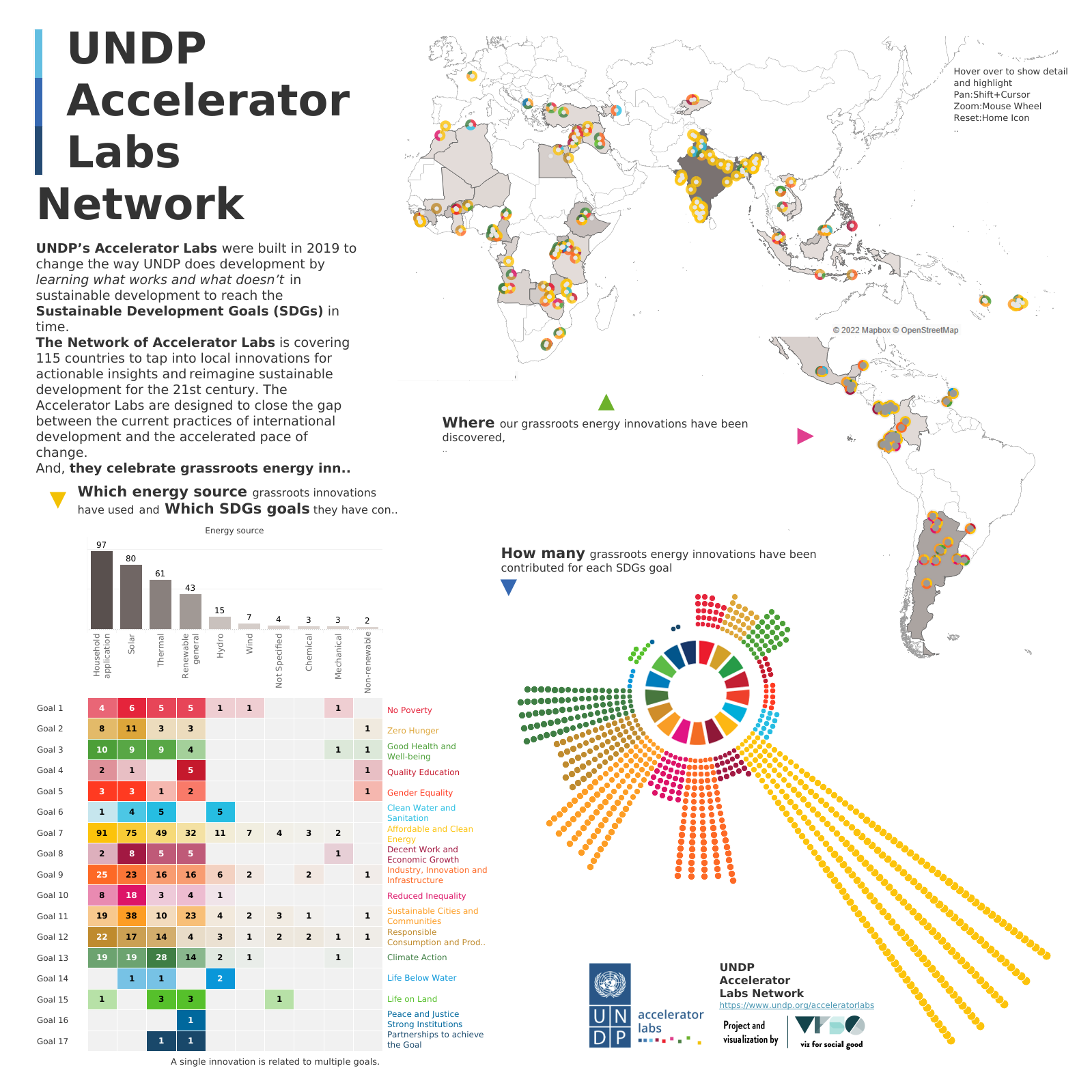
The Network of Accelerator Labs is composed of 91 Lab teams covering 115 countries to tap into local innovations for actionable insights and reimagine sustainable development for the 21st century. The Accelerator Labs are designed to close the gap between the current practices of international development and the accelerated pace of change.
Each Lab is comprised of three team members: Head of Solutions Mapping, Head of Experimentation, and Head of Exploration.
Project Information
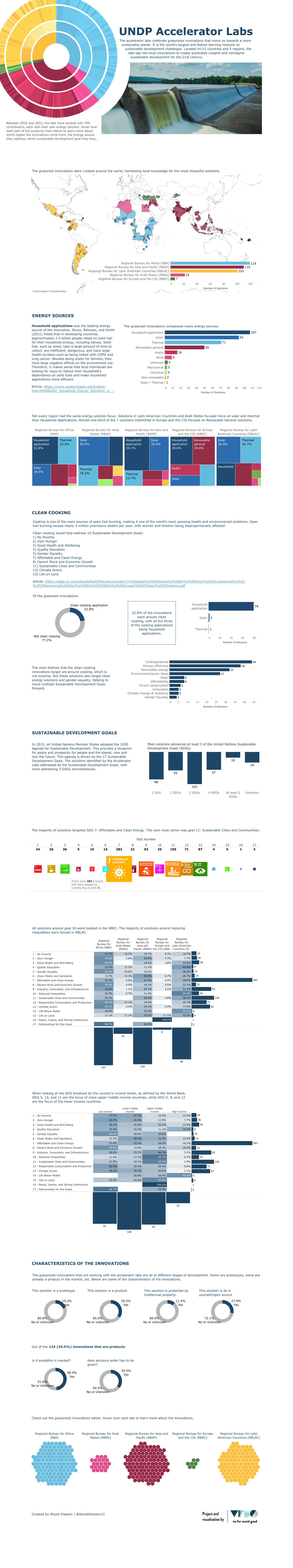
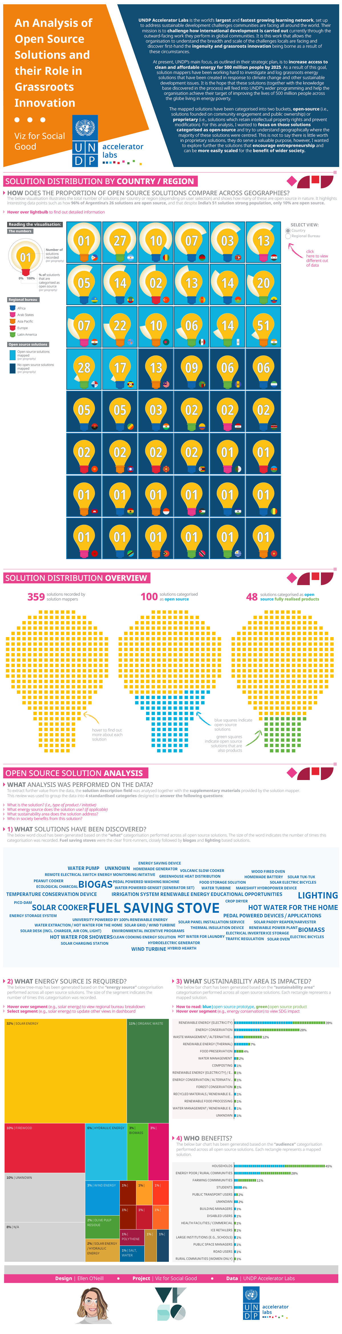
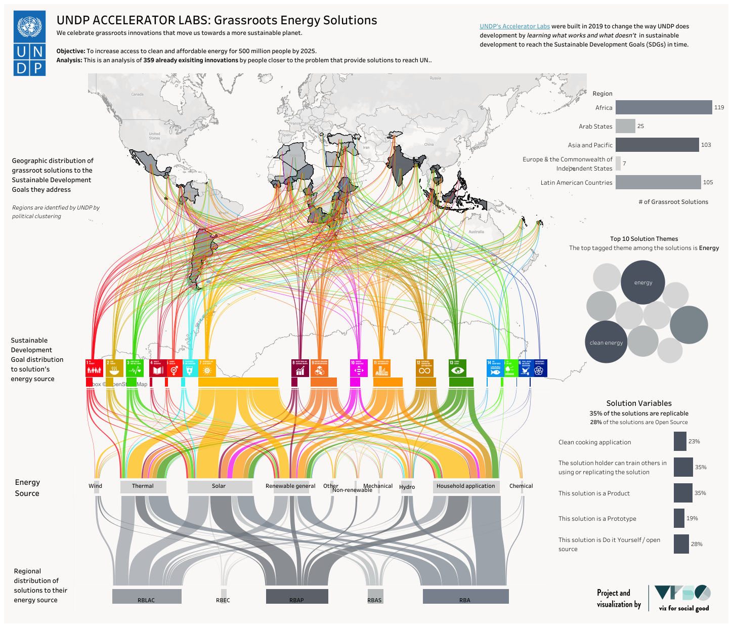
UNDP’s Strategic Plan (2022 – 2025) sets out the ambitious objective to increase access to clean and affordable energy for 500 million people by speeding up investment in distributed renewable energy solutions, especially for those hardest to reach and in crisis context. While large grid and financial flows at scale are essential to reach this goal, our Discover and Deploy Solutions Mapping campaign will explore bottom-up, lead user, frugal and grassroots innovations as a contribution to the sustainable energy access moonshot.
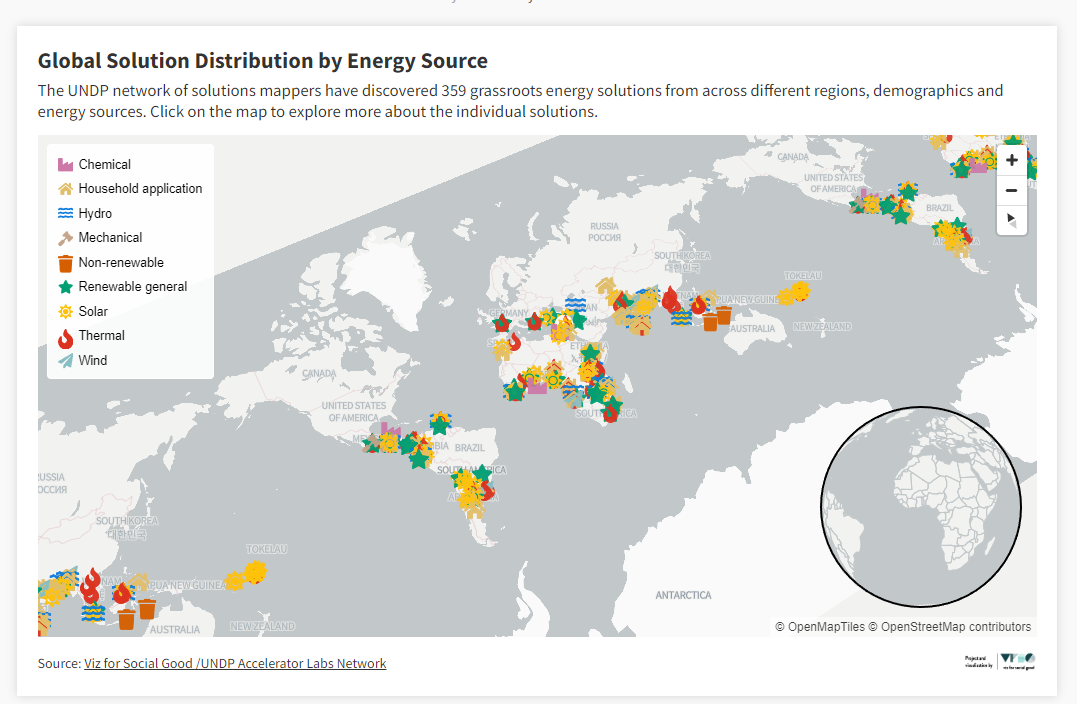
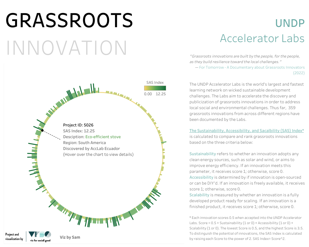
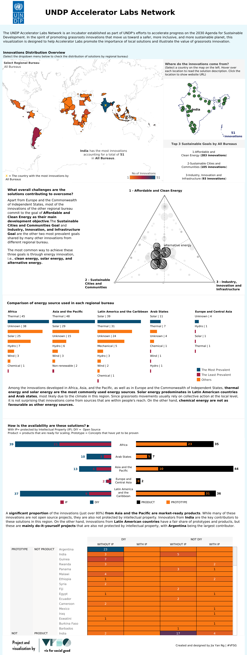
Over the course of 4 months, our network of solutions mappers has discovered 359 grassroots energy solutions from across different regions, demographics and energy sources. The discovered solutions help us to signify the importance of already existing grassroots solutions to energy conservation, augmentation, generation, storage, and distribution in early-stage use. Albeit these are often not yet distributed at scale their existence offers valuable insights and trends on how communities are overcoming their own challenges. We need to acknowledge the ingenuity and problem solving capacity found in many communities that in turn can feed into UNDP's programming and contribute to achieving UNDP’s ambitious mission moonshot.
Visualising the data is essential to help us advocate for the importance of local solutions, their added value and contribution to development at a time when innovation is direly needed given the emergence of contemporaneous crises and inertia in inter-governmental climate negotiations.
We expect to feature your data visualizations for our global communication campaign during the 2022 United Nations Climate Change Conference (COP 27), 6 – 18 November 2022.
Call-to-Action
Help us to showcase the value of grassroots innovation! We need easy to understand, yet powerful visualizations of the energy solutions we discovered that help us advocate for a more sustainable future. Be bold and creative. Cut the data in as many ways as possible – maybe you see something that we don’t?
Some guiding questions on what we look for:
Where are the solutions coming from? What is their distribution per country & per region?
What type of energy source is more prevalent, what is less? Are there differences per region, and why?
What are global commonalities across solutions; what are typical applications & use cases for solutions? Are there patterns that emerge when looking at the distribution per country & per region?
What overall challenges are the solutions addressing or contributing to overcome?
Which Sustainable Development Goals are the solutions advancing in particular, and how?
Looking at the use case of clean cooking solutions, what is their prevalence, distribution, and source of energy?
If applicable / information is available*:
How are the solutions solving a specific community problem? What are the solutions addressing or contribute to solving? (if applicable)
How can we display the more quantitative information (ratio of IP vs DIY solutions; Prototype vs Product) in an appealing way that signifies the availability of solutions in country? (if applicable)
…and any other pattern you may come up with!
Brownie points for GIF animations / dynamic data visualizations and infographics usable for social media and beyond as we intend to share your work for our global #PeoplePowered energy campaign in the run up of the United Nations Climate Change Conference (COP 27), 6 – 18 November 2022.
*Due to the global nature of our solutions mapping practice, which might differ from country to country, there is unfortunately some sparsity in the available data.
Audience
Government partners, international donor community, Development practitioners, Climate experts, Academia, the general public
Use of Data Visualisation
United Nations Climate Change Conference (COP 27), UNDP Accelerator Lab Website, Social media channels (Instagram, twitter), Annual reports, Blogs, other communications means
Data
Discover & Deploy solutions matrix/overview (download Excel file)
Download images (in the Archives folder) via Google Drive
Key dates
Slack
Selected volunteers submissions (click image in carousel)